Scores and Charts
How to display simple scores
The simple score is a score that can be set for each option. Each time the user selects a option, a process is performed that sums the scores.
The simple score can be displayed as a numerical value at the endpoint. To display simple scores, follow the steps below.
1. Register Scores for Options
-
Go to the screen.
Press the button to display the list of scores. Set the score for the option.
In the example below, A score of
5points is assigned to the option.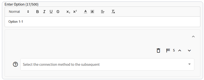
2. Check the Checkbox at the Endpoint
-
Turn on the toggle at the top of the screen to switch to Advanced Settings mode.
Check the checkbox to switch the question to endpoint and check the checkbox.
Even if you have registered a score for a option, the total score will not be displayed unless you check this checkbox at the endpoint.
3. Display in Template with Total Score Display Function
-
Moves to the screen. The total score can be displayed by using a template with a
Total Scoreas shown in the figure below. The button allows you to check the actual look and feel of the various templates.
The total score is often displayed as "TOTAL SCORE" in the endpoint, as shown in the figure below, but it depends on the design template used.

Summary of Simple Score Display Conditions
All of the following conditions must be met in order for the total score to be displayed.
- The design template has a total score display function.
- The checkbox in the panel is checked at each endpoint of the screen.
How to display scores by aggregate category
The Aggregate Category Score is a category-specific score that can be set for each option. Each time the user selects a option, a process is executed that sums the scores for each specified category.
Scores by aggregate category can eventually be displayed as a chart, such as a radar chart, at the endpoints. To display scores by aggregate category, follow the steps below.
1. Set Scores by Aggregate Category for Options
-
Moves to the screen.
Turn on the toggle at the top of the screen to switch to Advanced Settings mode.
When in Advanced Edit mode, the panel will appear as shown below.
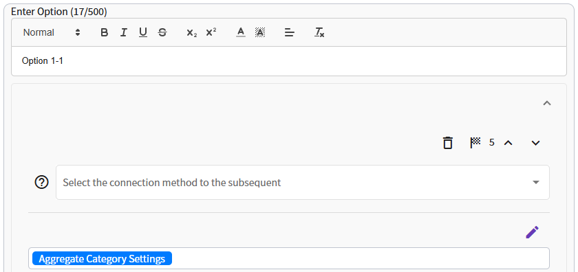
Next, press the button to register the aggregate category settings in the options.
Explanation of Terms
- As the name suggests, these are labels for the categories you wish to aggregate. For example, if you want to evaluate a company's employee satisfaction, the corresponding categories would be satisfaction with treatment, openness, and so on.
- It is the aggregate category score that is added when that option is selected.
-
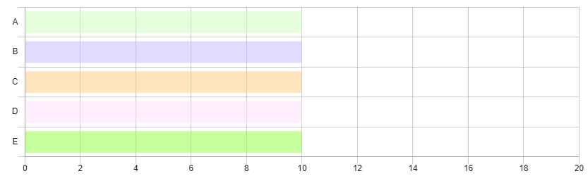
This setting is used to specify the order of the tally categories when displaying a tally chart. For a radar chart, the small numerical items are arranged in a clockwise direction. For a horizontal bar chart, the smallest numerical value items will be listed from the top to the bottom.
Set a number closer to 0 for the first item you want to display, and a larger number for the last item you want to display.
Concrete Example
-
In the example below, selecting
Yesto the question "Can you freely express your ideas and opinions to your supervisor?" means that5points will be added to the evaluation item for good openness.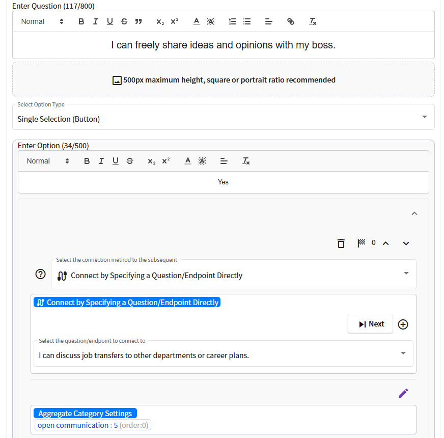
In the same way, questions are created, and aggregate category names and scores are registered for the options for the questions.
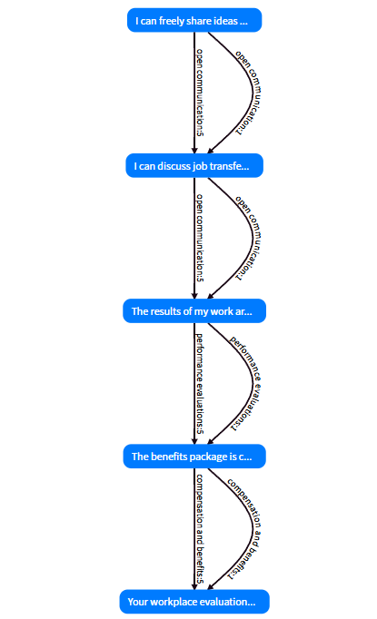
In this case, as an example of evaluating a company's employee satisfaction, we have created diagnostic content with the structure simply shown in the flowchart below. In a yes/no question, selecting "yes" adds
5points to the corresponding aggregate category, while selecting "no" will add only1point.The flowchart below was automatically generated by Judge's flowchart generation function.
2. Check the box at the endpoint
-
Check the checkbox to switch the question to an endpoint, Check the or checkbox.
Even if you have registered aggregate category settings, the aggregate chart will not be displayed unless you check this checkbox in the endpoint.
3. Display in a template with aggregate chart display functionality
-
Moves to the screen. You can display an aggregate chart by using a template that can display
Aggregate Chartas shown in the figure below (with the checkbox for tally chart checked). button to see how it really looks in various templates.
Below is the sample content we created for this demo. Let's test it out.
Template : Stepper, Black&White, tid-grcuv
Summary of display conditions for scores by aggregation category
To display scores by aggregate category, all of the following conditions must be met.
- Design template has aggregate chart display function.
- There is a set of aggregate category scores in the options selected to reach the quiz results.
- Specify a score by aggregate category for the data source at each endpoint in screen, and check the or checkbox.
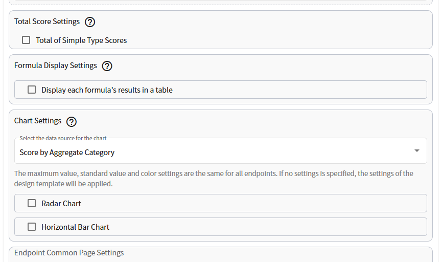
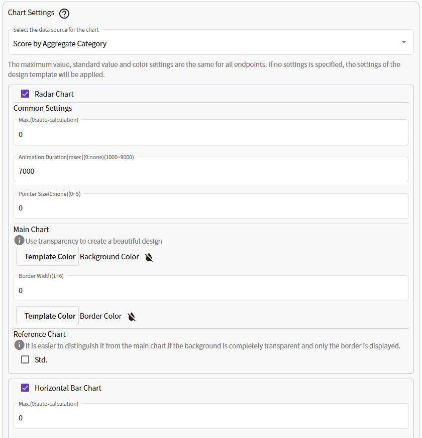
Chart Display Options
The Chart Display function displays a radar chart or horizontal bar chart.
You can choose either Scores by Aggregate Category or Formula as the source of information for the chart.
-
The radar chart and horizontal bar chart allow very detailed settings such as maximum value, standard value, animation time, and color settings, as shown in the figure below.
Terminology & Radar Chart
-
Maximum value of the display axis. The default setting adopts the maximum value for the axis from the maximum score for each aggregate category, but this option allows the specified value to be the maximum value for the display axis.
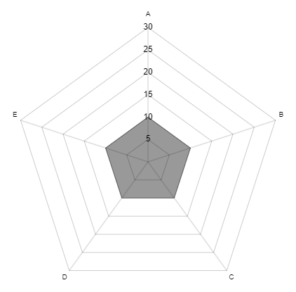
For example, if a radar chart is displayed when the scores of all the aggregated categories of the diagnostic results are low, the maximum value is automatically adopted in the default setting, resulting in a larger radar chart area as shown in the figure below.
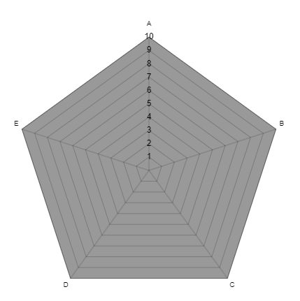
On the other hand, specifying a maximum value allows for a smaller radar chart area, thus avoiding visual misinterpretation.
-
Animation time for displaying aggregate charts.
0is no animation.Enter the value in units of [msec], so for example, if you want the animation to take 3 seconds, enter 3000.
-
A pointer is displayed at the endpoints of the chart at the specified size, as shown in the figure below.
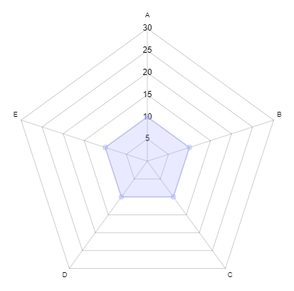
- Radar chart of scores by aggregate category or formula calculation results.
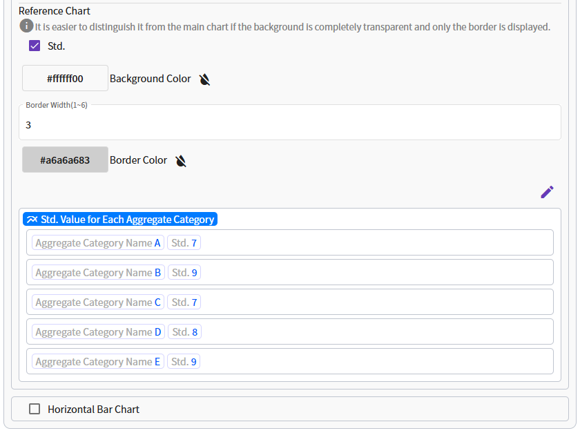
- This is a radar chart of reference or average values.
-
The satndard value for each aggregate category or formula name that is the basis for drawing the reference chart.
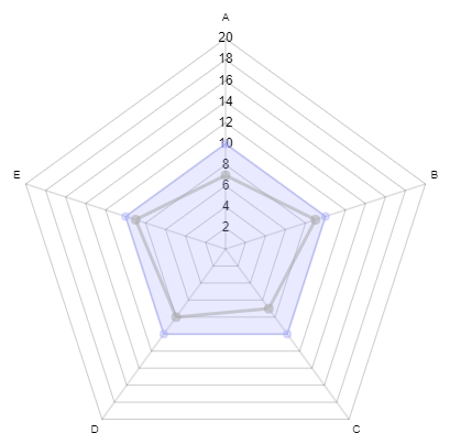
The standard values for each aggregate category displayed on the radar chart can be appended at the same time as the main chart, providing a visual representation of how much the quiz results have increased or decreased from the standard.
Terminology & Horizontal Bar Chart
- Maximum value of the display axis. The default setting adopts the maximum value of the axis from the maximum value of each aggregate value, but this option allows the specified value to be the maximum value of the display axis.
-
Animation time for displaying aggregate charts.
0is no animation. -
The background color of the bar chart that can be specified for each tally category. If not specified, the settings of the design template used will be applied.
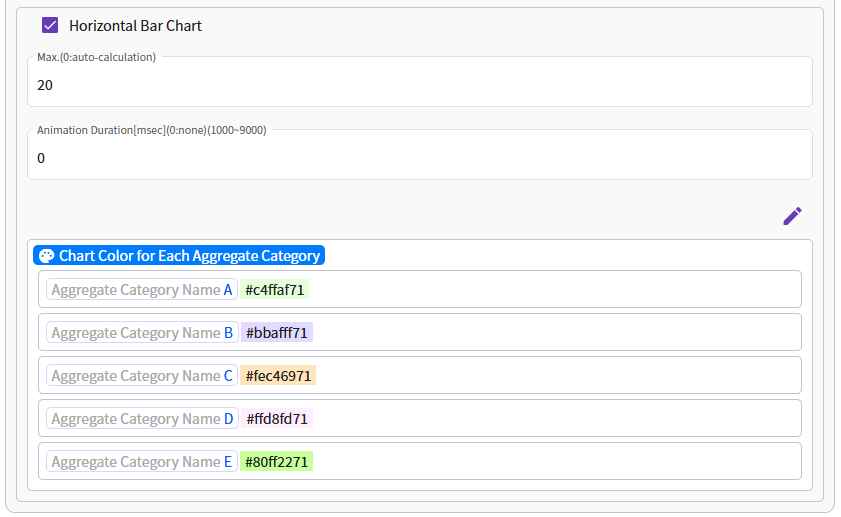
- The background color of the bar chart that can be specified for each formula. If not specified, the settings of the design template used will be applied.
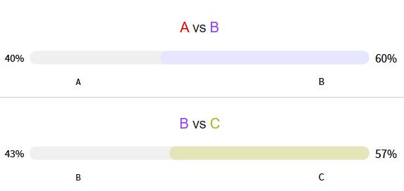
Terminology & 2D Slider Chart
The 2D Slider Chart compares the values of two specified categories and visualizes their proportional ratio using a slider.
-
You can edit the title of the chart using the rich editor.
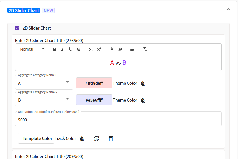
- The left category of the dual-axis ratio chart. If aggregation category scores or formulas have been set, you can select them from the dropdown menu.
- The right category of the dual-axis ratio chart. If aggregation category scores or formulas have been set, you can select them from the dropdown menu.
-
The animation duration for displaying the chart. A value of
0disables the animation. - You can specify the theme color for the left and right categories of the dual-axis ratio chart. The color of the category with the larger value takes precedence in rendering.
- You can specify the color of the slider track in the dual-axis ratio chart. Choose a visually clear color that matches the template in use.